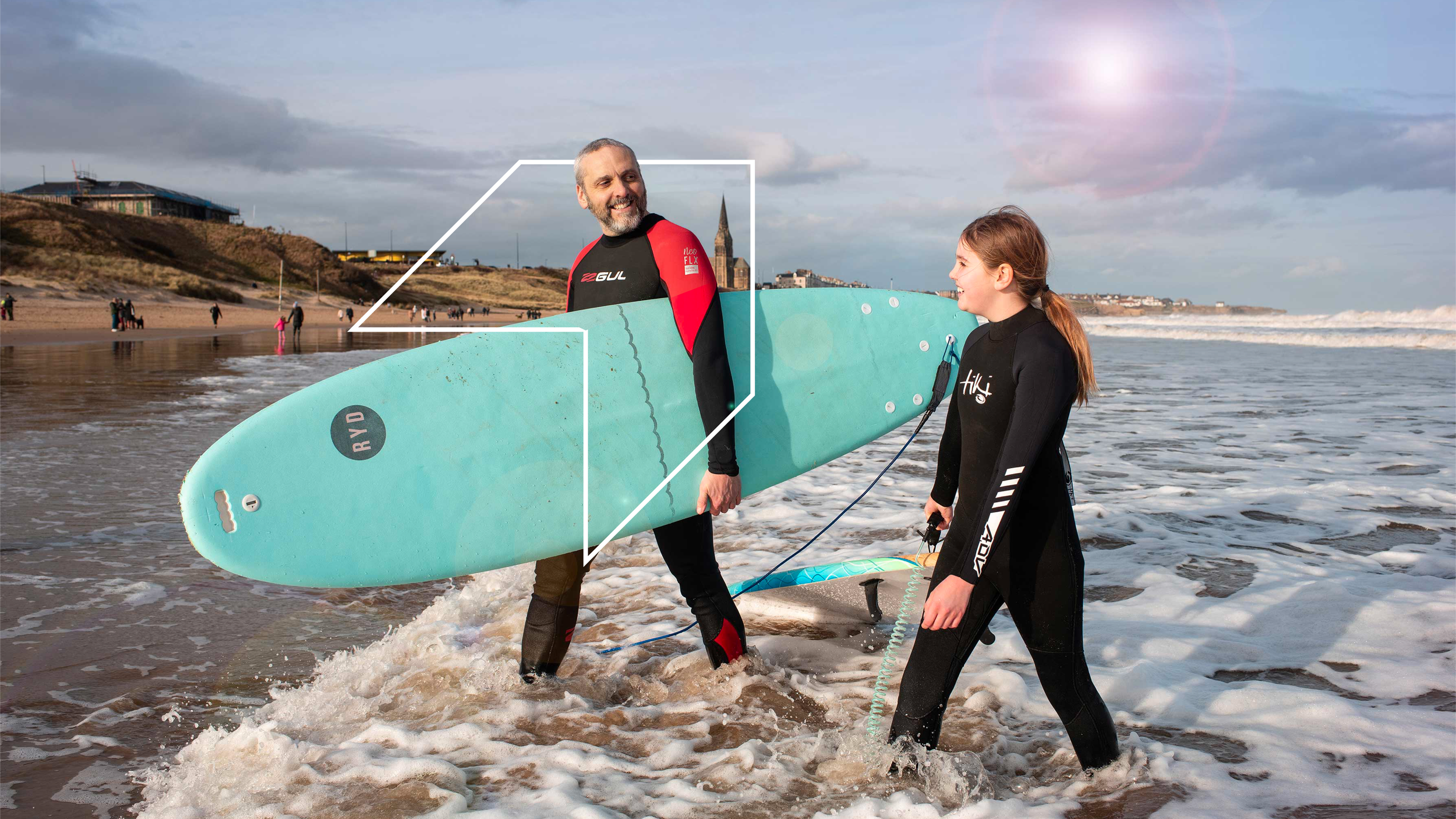
neCa branding
The North East Combined Authority needed an identity from scratch, for a brand-new mayoral authority representing the whole region. When we looked at how other UK combined authorities were presenting themselves, most were still leaning on civic, institutional identities.
That was the gap, a chance to build something that actually looked and felt confident, rather than just official.
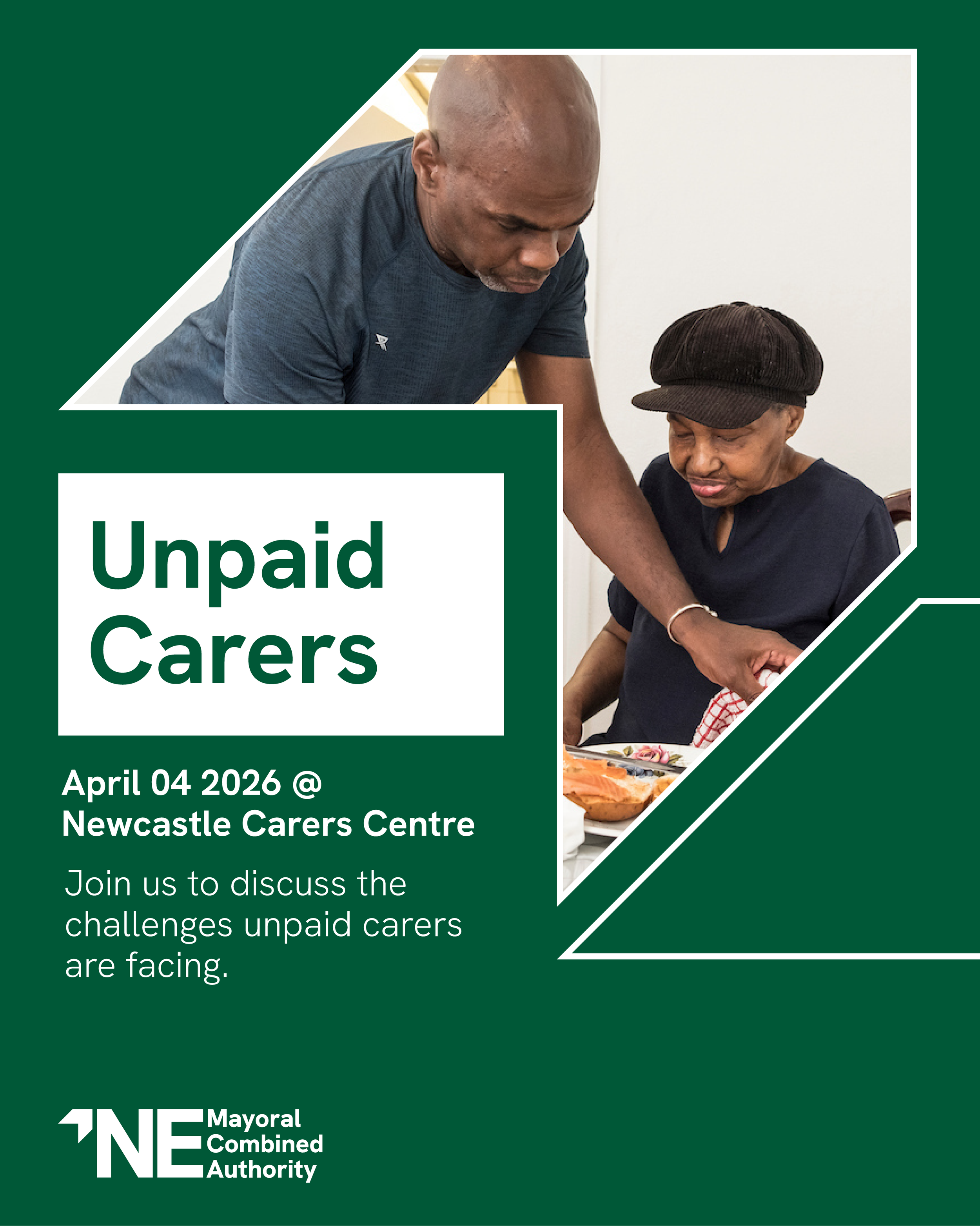
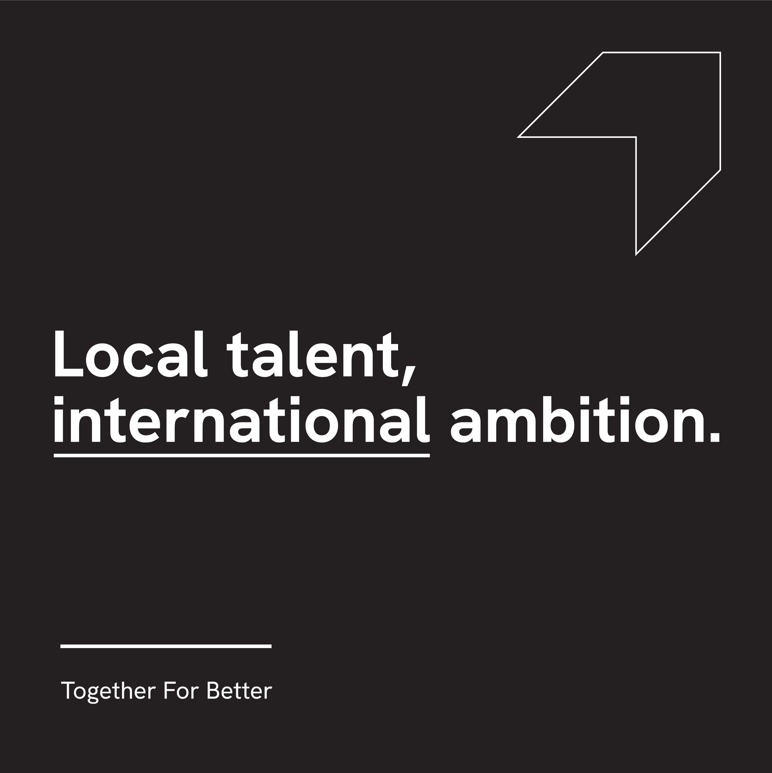
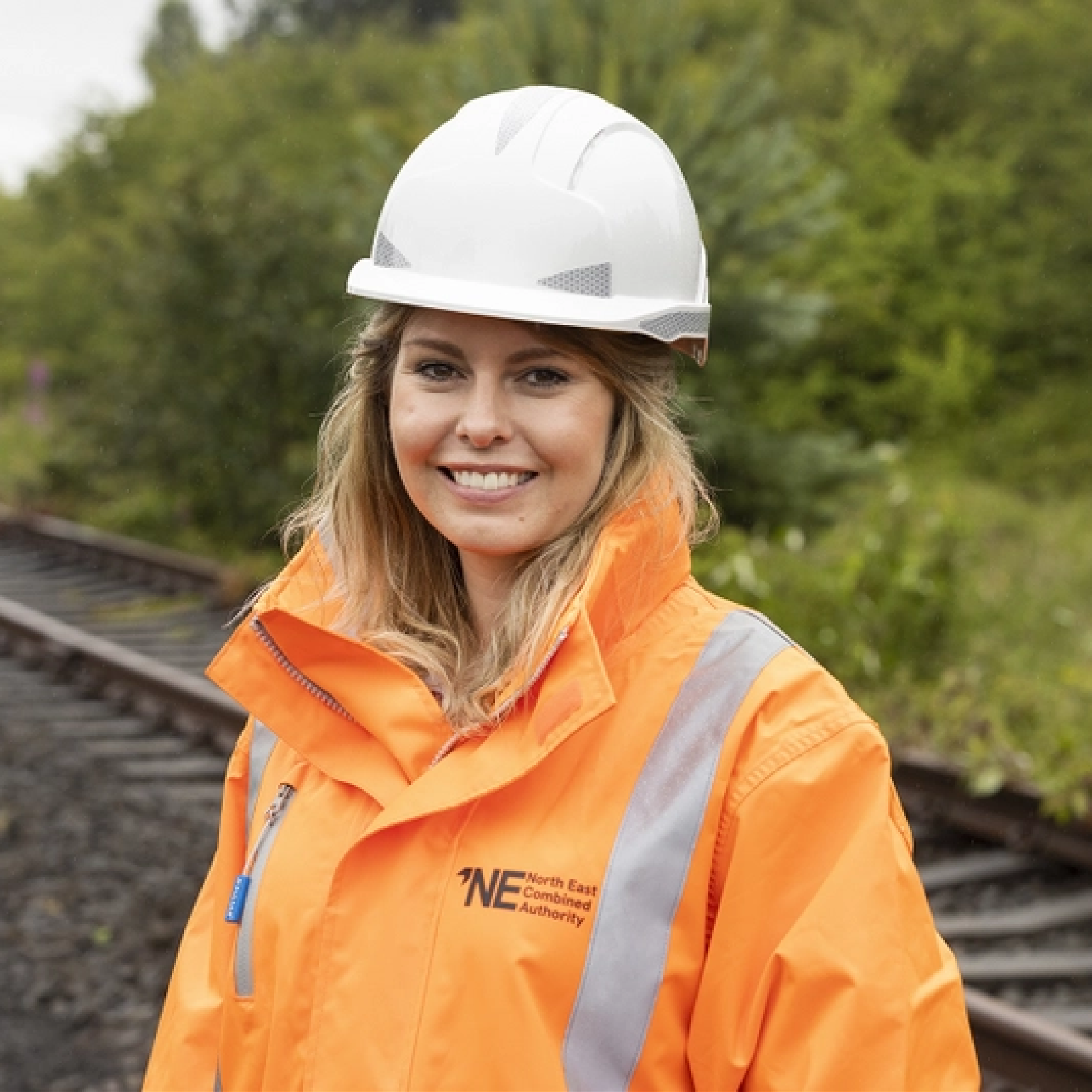
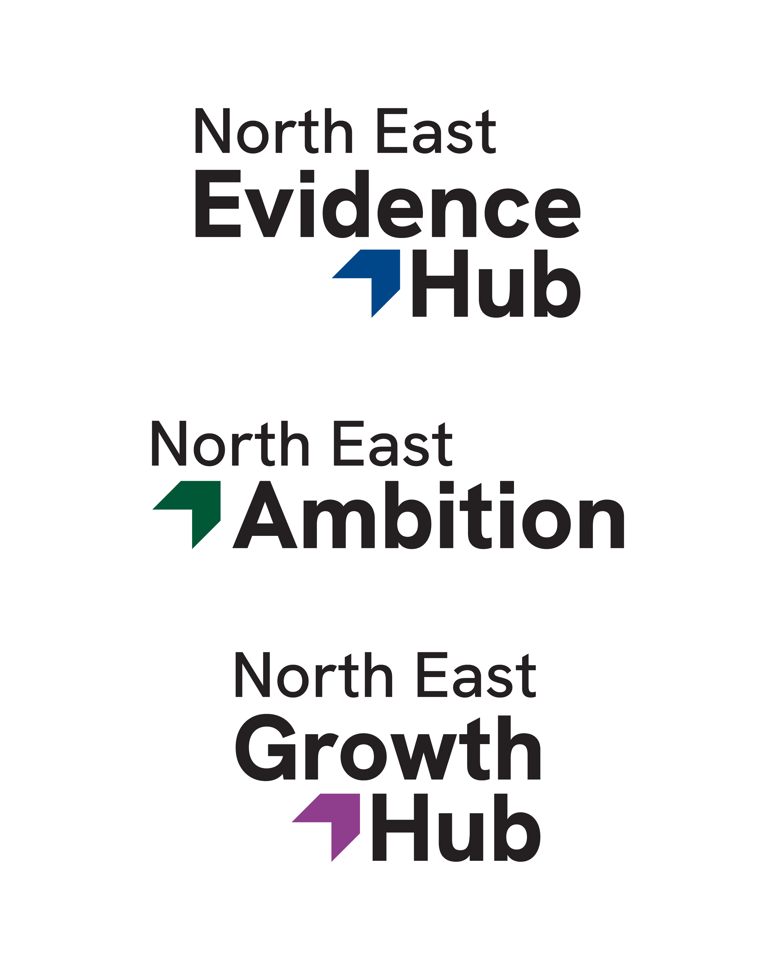
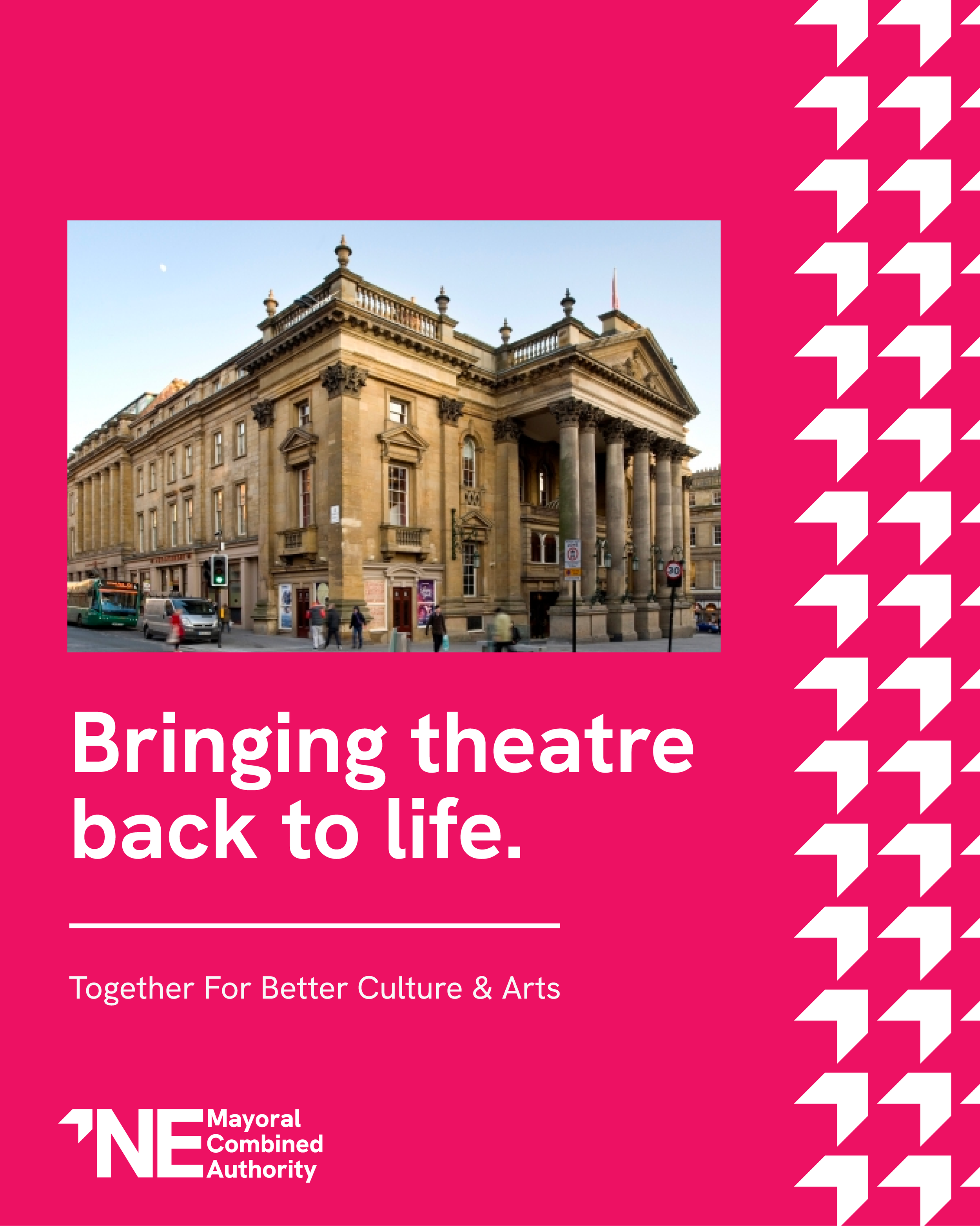
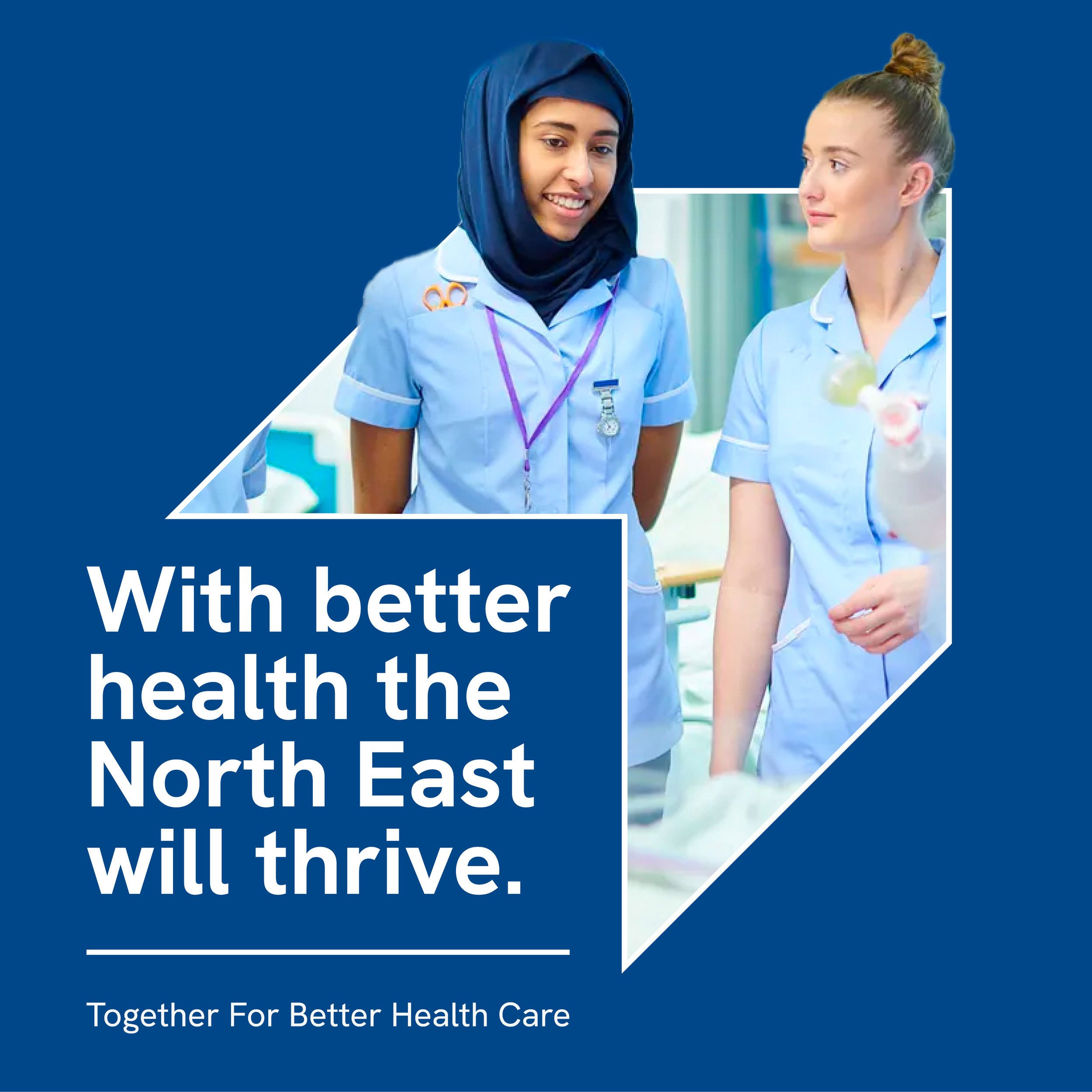
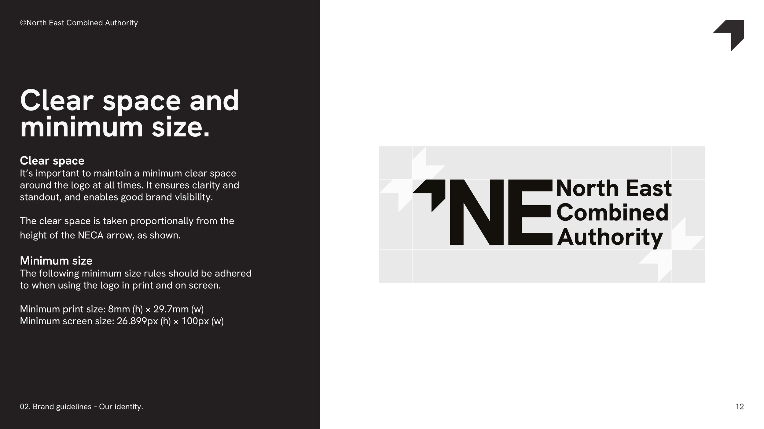
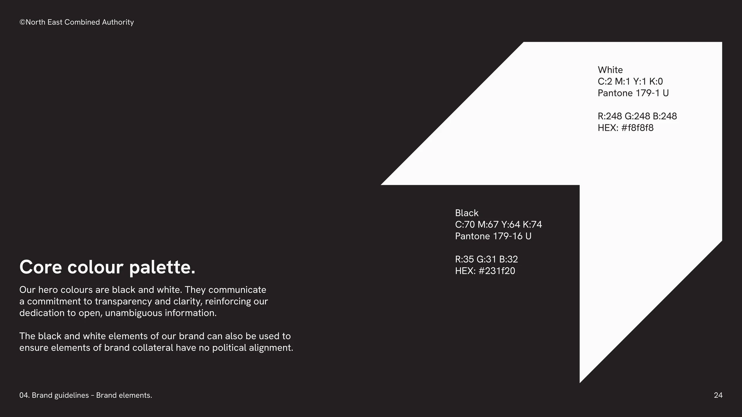
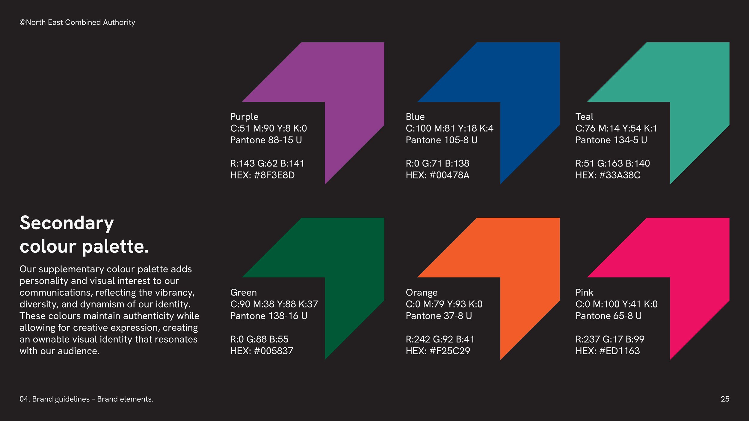
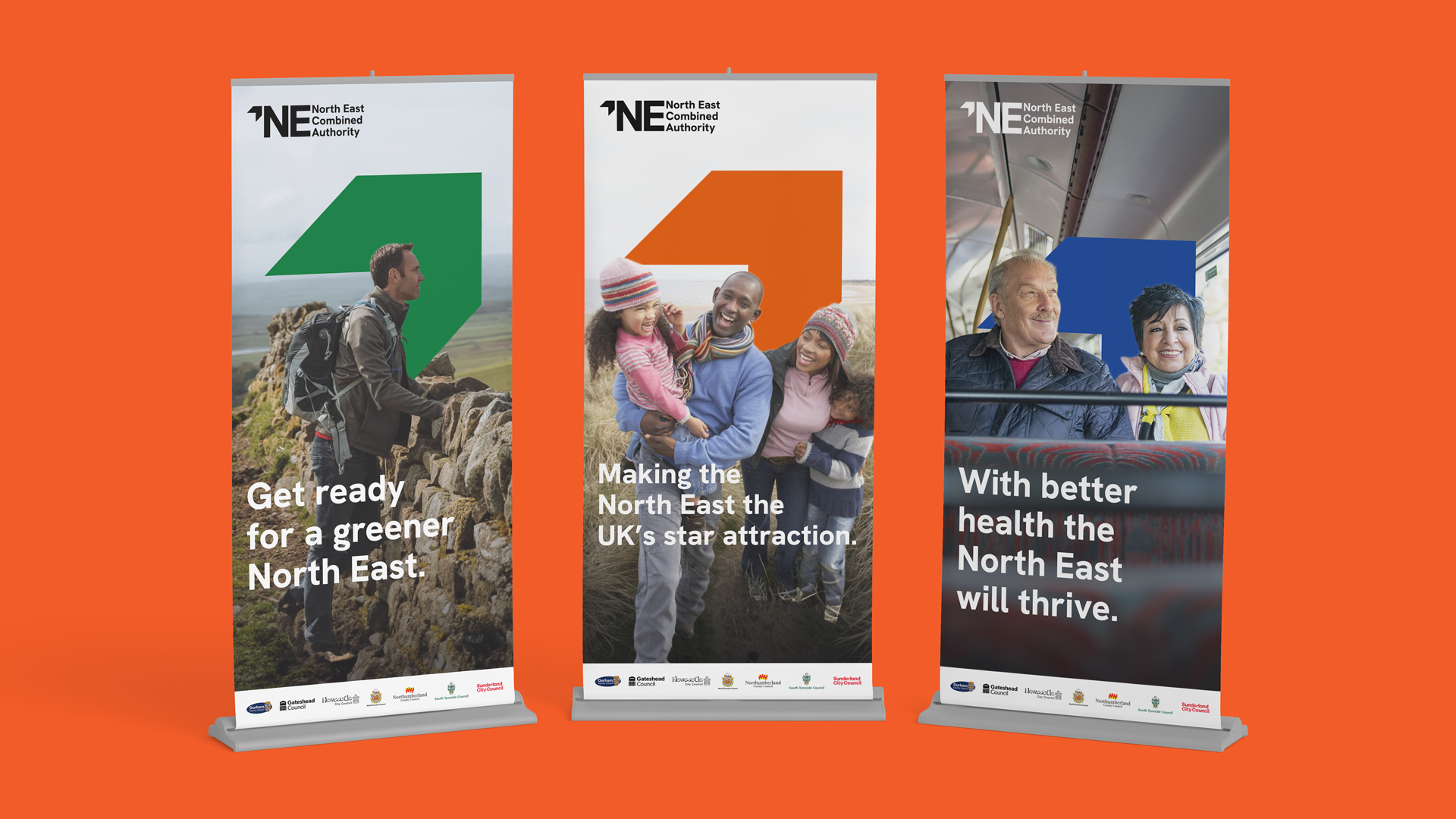
I led the design system and art direction. The mark is a bold NE arrow, doubling as a standalone icon, paired with a wordmark built to work across everything from council literature to public-facing campaigns. Black and white anchor the core palette, but the system was built to flex rather than stay fixed. We suggested the mayor's own logo, which sits in the same visual style, could pick up the colour of their political party on the arrow: the current mayor, Kim McGuinness, now runs a red version of the arrow to reflect her Labour affiliation. Six further secondary colours sit alongside black and white for use across the wider system, kept apart from each other rather than paired.
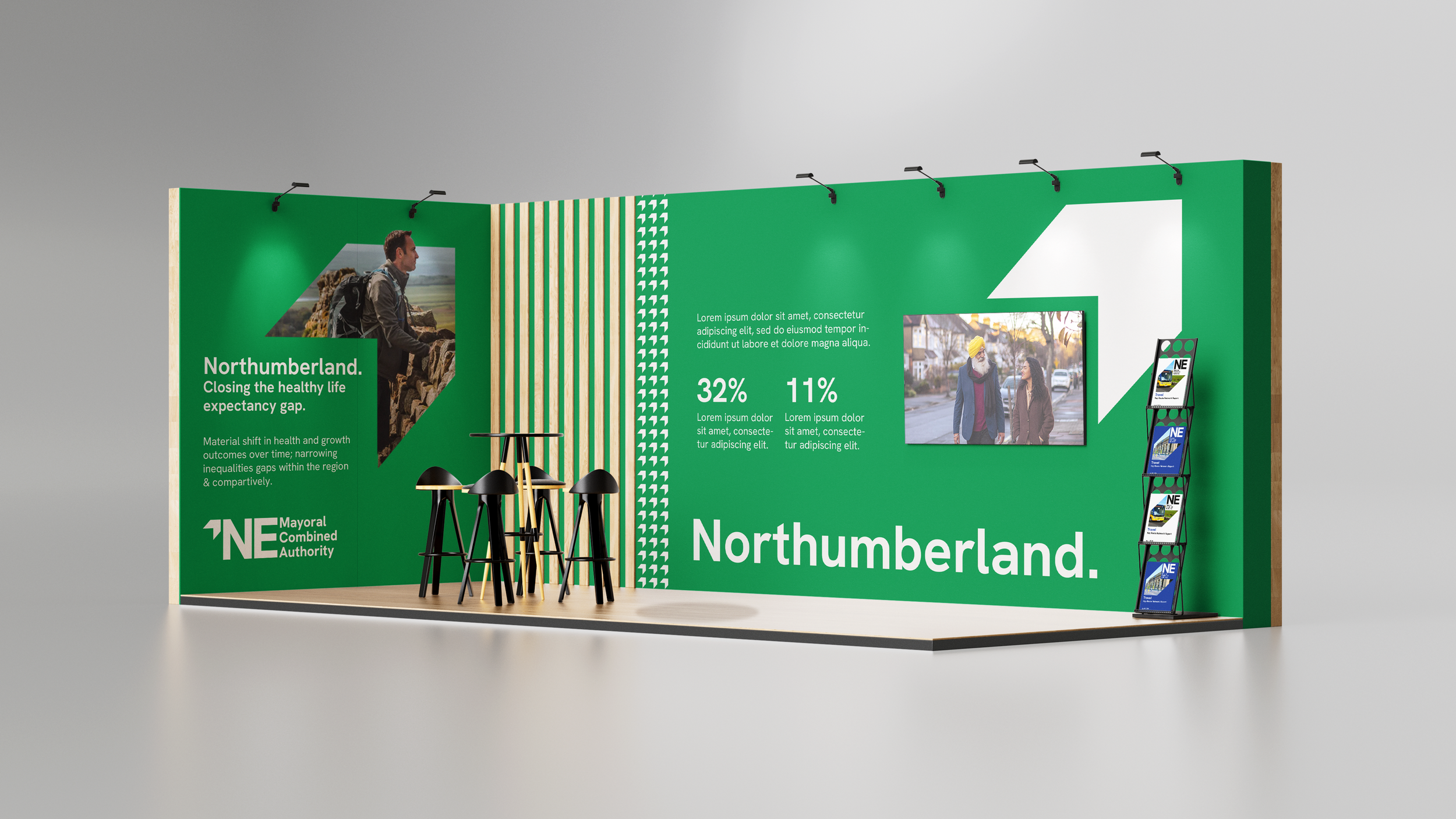
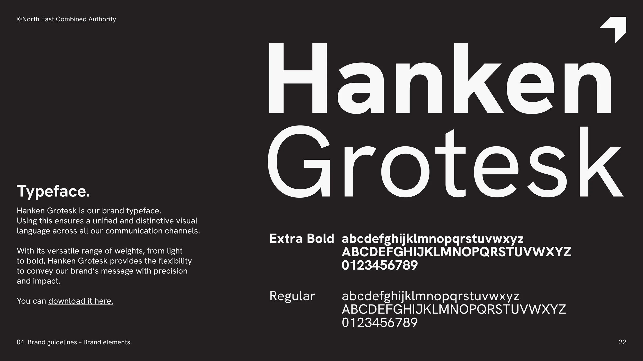
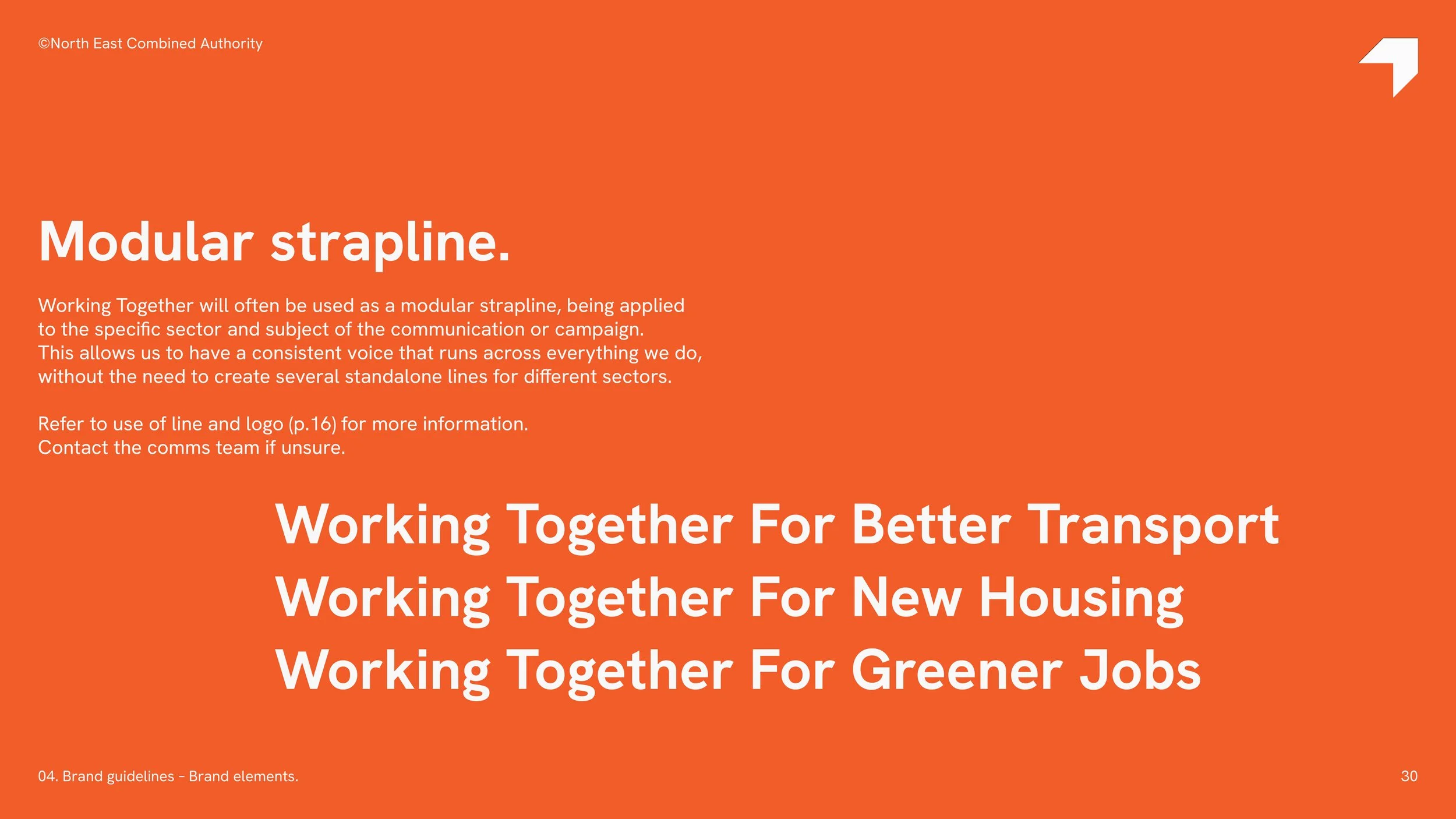
The strap-line, "Working Together," runs through the system in both a master and a modular form, so it can flex across partnership lock-ups and "funded by" credits without losing consistency. Hanken Grotesk carries the brand typeface work, with Calibri as the practical fallback for the day-to-day documents a public authority actually produces.
Alongside the visual system, I worked with Paul Williams (copywriter) on the brand guidelines themselves, "Snappy Not Snooty," "Be A Doer," with "we do/we don't say" examples throughout, so the tone of voice carried the same confidence as the mark. It's a system built to represent everyone in the region as one brand, leading the North East into a limitless future.